
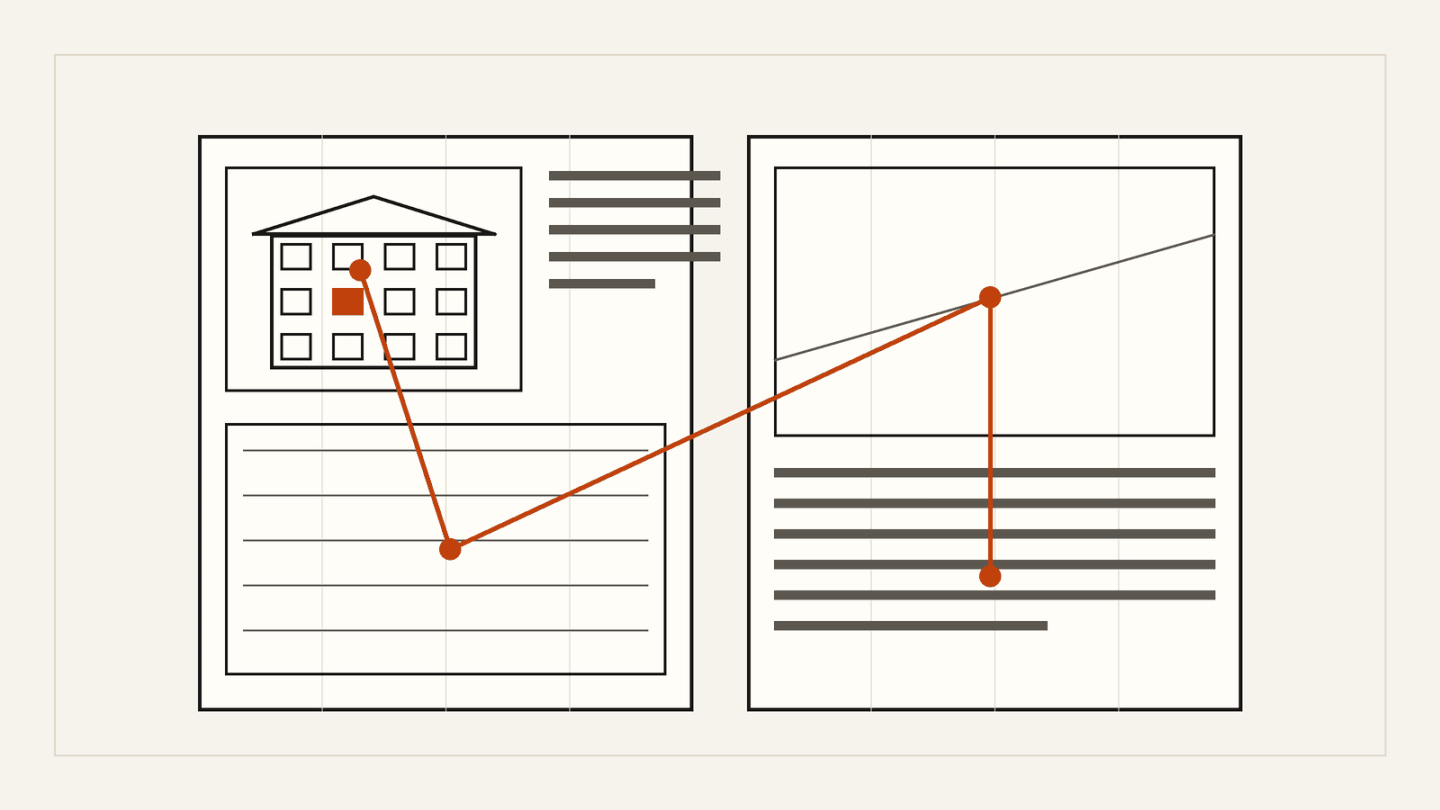
Competition boards are read on a wall, on a screen and as a small preview. A good layout works in all three: from a distance the idea is obvious, and up close the details support it.
One idea per board
Decide what each board has to say before you place anything. The first board carries the main idea and the strongest image. Later boards explain how the idea works in plan, section and detail.
A clear reading order
- Use a grid and stick to it. Consistent margins make a set of boards read as one.
- Place the most important image top left or at the largest size.
- Number the drawings if the order is not obvious.
Text on boards
Write short paragraphs next to the drawings they explain. Use one typeface, two sizes and enough contrast to read from a few steps away. Long blocks of text belong in the project text, not on the board.
Check before you export
- Print the boards small, or view them at preview size, and see whether the idea still reads.
- Check the file size and format rules.
- Remove names and logos if the competition is anonymous.